

Choosing between two whites sounds like it should be simple. It never is. Shoji White (SW 7042) and Alabaster (SW 7008) are two of Sherwin-Williams’ most-requested neutrals — both warm, both sophisticated, both capable of transforming a room. But they behave very differently depending on your light, your floors, and what you are asking them to do. Pick the wrong one and a room that should feel calm and luminous will instead feel dingy, yellow, or cold.
This guide gives you everything you need to make the right call. We compare both colors across undertone, LRV, performance in different light conditions, and the specific rooms and design styles each one serves best.
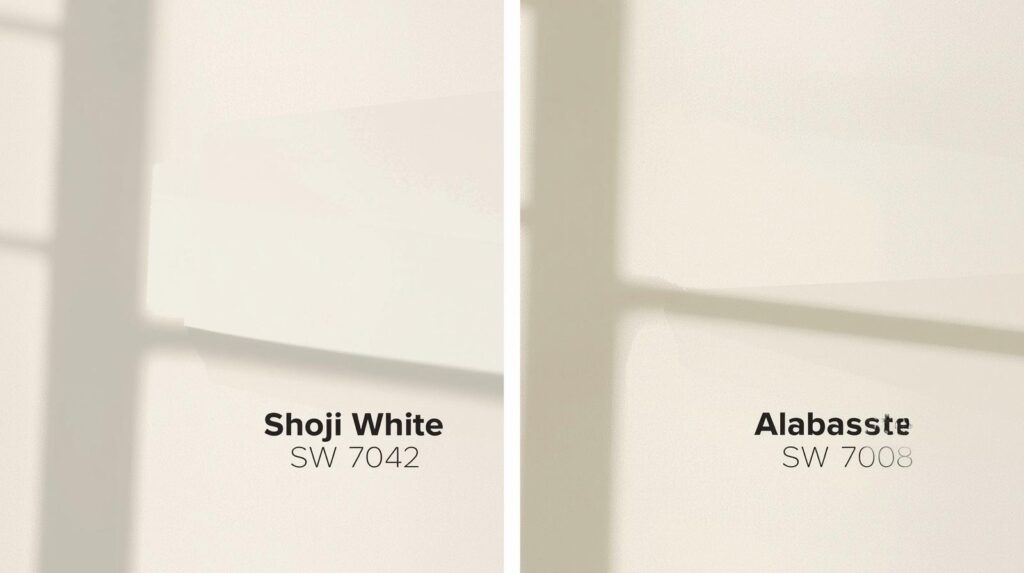
The Quick Facts: Shoji White vs Alabaster at a Glance
| Shoji White SW 7042 | Alabaster SW 7008 | |
| Color Number | SW 7042 | SW 7008 |
| LRV | 74 — bright but not stark | 82 — one of SW’s lightest whites |
| Undertones | Warm greige — beige + green | Warm cream — soft yellow/orange |
| Temperature | Cooler warm neutral | Warmer soft white |
| Best Lighting | North or east-facing rooms | South or west-facing rooms |
| Finish Rec. | Eggshell or satin | Flat, eggshell, or satin |
| Best Rooms | Living, dining, office | Bedroom, hallway, trim, exterior |
| Pairs Well With | Greige, gray, navy, sage | Wood tones, cream, warm terracotta |
LRV = Light Reflectance Value. The higher the number, the more light the color reflects. A higher LRV makes rooms feel larger and more open.
Understanding the Undertones — This Is Where They Diverge
Both colors are warm whites — but the nature of that warmth is fundamentally different, and this difference determines which one works in your specific room.
Shoji White SW 7042
Shoji White carries a greige undertone — a blend of beige and a quiet green or gray warmth. In good light it reads as a clean, pale neutral that sits between cool and warm. In lower light or north-facing rooms it can reveal its green-gray side, which is not a defect — it is why interior designers reach for it when they want a white that feels sophisticated rather than simply bright. It is a white that has discipline.
Alabaster SW 7008
Alabaster is warmer, creamier, and more forgiving. Its undertone is a soft yellow with a touch of orange — the warm end of the neutral spectrum.In most lighting conditions it reads as a rich, slightly creamy white rather than a stark bright one. Strong natural light makes it glow. Under warm artificial light, it deepens into something genuinely luxurious. It is harder to make Alabaster look wrong than Shoji White, which is one reason it became Sherwin-Williams’ Color of the Year in 2016 and has remained among their best-sellers ever since.
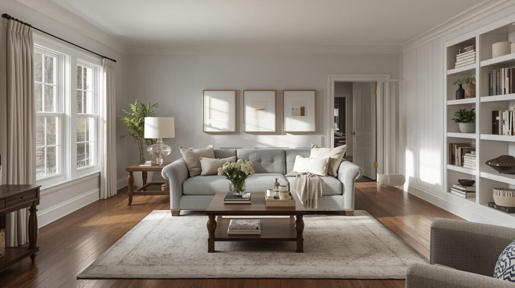
How Light Changes Everything
The single biggest mistake people make when choosing white paint is picking a color on a paint chip and not testing it on their actual walls in their actual light. White paints are among the most light-sensitive colors in the entire spectrum — the same chip can look completely different in a south-facing room versus a north-facing one, or under warm incandescent bulbs versus cool LED daylight.
- North-facing rooms (cool, indirect light): Shoji White performs beautifully here — its greige warmth counterbalances the cool blue quality of north light, producing a balanced neutral. Alabaster in north-facing light can feel slightly flat or even a little gray.
- South-facing rooms (strong, warm light all day): Alabaster shines in south-facing rooms — literally. The direct, warm sunlight amplifies its creamy warmth and the room glows throughout the day. Shoji White in very strong light can appear almost stark white, losing some of its character.
- East-facing rooms (warm morning, cooler afternoon): Both colors work well. Shoji White catches the morning light beautifully. Alabaster maintains its warmth through the cooler afternoon hours.
- West-facing rooms (cool morning, warm afternoon/evening): Alabaster excels in west-facing rooms because the warm evening light plays perfectly to its creamy undertone, creating a glowing, intimate quality at the end of the day.
- Artificial lighting: Warm bulbs (2700–3000K) amplify Alabaster’s creaminess and can push it toward yellow. Neutral to cool bulbs (3500–4000K) work well with both colors. Test both under your actual artificial lighting before committing.
Best Rooms and Uses for Each Color
Where Shoji White Works Best
- Open-plan living and dining spaces: Its balanced greige quality holds well across large surfaces and across varying light throughout the day.
- Home offices and studies: The slightly cooler neutrality of Shoji White reduces eye fatigue in working environments and complements most monitor setups.
- Paired with cool or mid-tone grays: Shoji White sits naturally alongside gray sofas, stone countertops, and slate or concrete elements.
- Modern and transitional interiors: The disciplined, slightly sophisticated tone of Shoji White suits cleaner-lined, more contemporary design palettes.
Where Alabaster Works Best
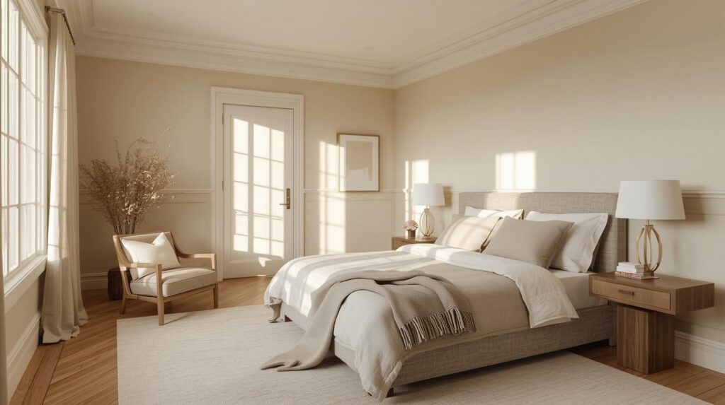
- Bedrooms and hallways: Alabaster’s warmth creates an inviting, restful quality that makes it one of the most universally successful bedroom whites available.
- Trim, ceilings, and millwork: Alabaster is one of the most widely used trim whites precisely because its warmth complements almost every wall color rather than fighting it.
- Exteriors: On exterior siding and trim, Alabaster delivers a classic, warm white that reads as clean and welcoming from the street without the brightness of a pure white.
- Farmhouse, coastal, and classic traditional interiors: The creamy, soft nature of Alabaster suits these styles perfectly, complementing natural wood, linen, and rattan elements.
Shoji White Best For: North-facing rooms, modern interiors, open-plan spaces, rooms with cool or gray accents.
Alabaster Best For: South or west-facing rooms, bedrooms, trim and millwork, warm traditional or farmhouse styles.
Can You Use Both in the Same Home?
Yes — and many designers do exactly this. A common and highly effective approach is to use Alabaster on all trim, ceilings, and millwork throughout the house, and Shoji White on the walls of living spaces and hallways where a slightly cooler, more neutral quality is desired. The two colors are close enough in value to read as a coordinated scheme rather than a mismatch, while the subtle contrast between wall and trim adds visual depth and definition.
The key rule: never use Shoji White on trim and Alabaster on walls in the same room. The warm creaminess of the Alabaster wall will make the greige trim look slightly gray or dirty by comparison. Always keep Alabaster at the warmer position (trim or ceiling) and Shoji White at the cooler one (walls).
Frequently Asked Questions
Q: Is Shoji White warmer or cooler than Alabaster?
A: Shoji White is cooler than Alabaster. Both are warm whites, but Shoji White’s greige undertone sits closer to the middle of the warm-cool spectrum, while Alabaster’s creamy yellow undertone places it firmly on the warm side. In the same room and same light, Alabaster will always read as warmer.
Q: Which is better for a small room?
A: Alabaster, in most cases. Its higher LRV of 82 (versus Shoji White’s 74) means it reflects more light and makes spaces feel larger. For a small room in good natural light, Alabaster’s warmth and brightness combination is difficult to beat. In a small north-facing room with limited light, Shoji White’s character may make the room feel slightly heavy — Alabaster would be the safer choice.
Q: Does Shoji White look gray?
A: It can appear to have a gray or green-gray cast in north-facing rooms with cool indirect light, under cool LED bulbs, or next to very warm colors that throw its cooler undertone into relief. On its own in balanced natural light, most people read it simply as a warm neutral white. Always test a large sample on your actual walls before committing.
Q: Which color is better for kitchen cabinets?
A: Alabaster is generally the more popular choice for painted kitchen cabinets because its warmer, creamier tone reads as genuinely white without being stark, and it complements both warm wood tones and cooler stone countertops well. Shoji White on cabinets is a beautiful choice in a kitchen with consistent warm natural light, but it requires more care in lighting selection to prevent it reading gray against very warm elements.
Q: Do I need to test before painting?
A: Absolutely — and this applies to both colors. Purchase a sample pot and paint at least an A3-sized swatch directly onto the wall you intend to paint. Observe it at multiple times of day, in both natural and artificial light, and next to the key fixed elements of the room (floor, furniture, countertop). No paint chip, screen image, or description — including this one — substitutes for seeing the color on your actual wall in your actual light.
The Verdict
Shoji White and Alabaster are both exceptional colors — some of the most reliably beautiful whites in the Sherwin-Williams range. They are not interchangeable, and the choice between them should be driven by the specific light conditions of your room, the warmth of your existing finishes, and the feeling you are trying to create.
If your room receives cool or indirect light, if your palette leans toward gray, greige, or cooler accents, or if you want a white that reads as clean and disciplined without being stark — choose Shoji White. If your room gets warm natural light, if you are working with wood tones, warm textiles, or a farmhouse or traditional aesthetic, or if you want a white that feels genuinely inviting and impossible to dislike — choose Alabaster.
Test both. Trust what you see on your wall. And remember that no white is ever just white.
Your Searching : Shoji White vs Alabaster, SW 7042 vs SW 7008, Sherwin-Williams white paint comparison, best warm white paint, Alabaster paint color review, Shoji White undertone, white paint for north facing room, best white paint for trim, Sherwin-Williams neutral whites 2026